Simple Hero Block Documentation
Overview
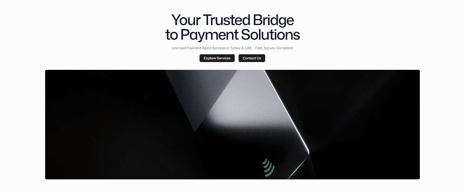
The Simple Hero block is a versatile and powerful component designed for creating impactful landing page headers and hero sections. It combines compelling typography, call-to-action buttons, and optional hero imagery in a clean, responsive layout.
Purpose and Use Cases
Primary Use Cases
Landing page headers with compelling headlines
Product announcements with featured imagery
Service introductions with clear value propositions
Campaign banners with strong call-to-action buttons
About page heroes with brand messaging
Design Philosophy
The Simple Hero follows a center-aligned, mobile-first approach that ensures maximum impact across all devices. The component prioritizes readability and conversion optimization through strategic use of typography hierarchy and button placement.
Component Structure
Blade Architecture
<div class="wrapper simple-hero-wrapper">
    <section class="block simple-hero-block">
        <div class="container simple-hero-container">
            <div class="simple-hero-content">
                <h1 class="simple-hero-heading">...</h1>
                <p class="simple-hero-text">...</p>
                <div class="simple-hero-buttons">...</div>
            </div>
            <div class="simple-hero-image">...</div>
        </div>
    </section>
</div>
CSS Classes Reference
Container Classes
.simple-hero-wrapper
Purpose: Outermost container for the entire hero section
Styling: Handles background colors, spacing, and overall layout
Customization: Add custom background images, gradients, or patterns
Usage: Apply section-wide styling modifications
.simple-hero-block
Purpose: Main semantic container for the hero content
Styling: Default background and semantic structure
Customization: Override background colors, add shadows or borders
Usage: Section-level visual modifications
.simple-hero-container
Purpose: Content width and padding container
Styling: Responsive max-width, padding, flexbox layout
Customization: Adjust container width, spacing, and layout direction
Usage: Control content boundaries and internal spacing
Content Classes
.simple-hero-content
Purpose: Wrapper for all text and button content
Styling: Center alignment, max-width constraints, vertical spacing
Customization: Change alignment, max-width, or layout direction
.simple-hero-heading
Purpose: Main headline styling and typography
Typography: Uses system font stack with optimized letter spacing
Responsive: Scales from 30px on mobile to 48px on desktop
Customization: Override font-size, weight, or add text effects
.simple-hero-text
Purpose: Descriptive text below the main heading
Typography: Secondary color for hierarchy
Responsive: Adds horizontal padding on larger screens
Customization: Adjust font size, color, or line height
.simple-hero-buttons
Purpose: Container for call-to-action buttons
Responsive: Buttons wrap naturally on smaller screens
Customization: Change alignment, spacing, or layout direction
Image Classes
.simple-hero-image
Purpose: Hero image container with responsive behavior
Responsive: Fixed aspect ratio with object-fit controls
Customization: Adjust height, add borders, or change border-radius
Block Settings Integration
Custom Classes
The Simple Hero block supports additional CSS classes through Statamic's block settings:
{{ $block->block_settings->block_classes ?? '' }}      // Applied to .simple-hero-wrapper
{{ $block->block_settings->container_classes ?? '' }}  // Applied to .simple-hero-container
Inline Styles
Custom inline styles can be applied through block settings:
{{ $block->block_settings->block_styles ?? '' }}      // Applied to .simple-hero-block
{{ $block->block_settings->container_styles ?? '' }}  // Applied to .simple-hero-container
Content Fields
Available Fields
heading (Rich Text): Main hero headline
text (Rich Text): Supporting descriptive text
buttons (Replicator): Array of button components
image (Asset): Optional hero image
image_scaling (Select): Cover or contain image scaling
Field Validation
heading: Optional but recommended for context
text: Optional but recommended for context
buttons: Optional, supports multiple buttons
image: Optional, automatically optimized
Responsive Behavior
Breakpoint Strategy
/* Mobile (default) */
.simple-hero-heading { font-size: 1.875rem; }
.simple-hero-text { padding: 0; }

/* Desktop (1024px+) */
@media (min-width: 1024px) {
  .simple-hero-heading { font-size: 3rem; }
  .simple-hero-text { padding: 0 4rem; }
}
Layout Adaptations
Mobile: Single column, stacked content
Tablet: Maintains single column with increased spacing
Desktop: Optional side-by-side layout for text and image
Performance Considerations
Image Optimization
Images are automatically processed through Statamic's Glide
WebP/AVIF formats are served when supported
Lazy loading is enabled by default
Responsive srcset attributes are generated
CSS Loading
Critical CSS is inlined for above-the-fold content
Non-critical styles are loaded asynchronously
CSS custom properties enable theme switching
Accessibility Features
Semantic HTML5 structure
Proper heading hierarchy (h1)
Focus-visible styles for buttons
Screen reader friendly text balance
Best Practices
Content Guidelines
Headline: Keep under 10 words for maximum impact
Text: 2-3 sentences explaining value proposition
Buttons: Maximum 2 buttons, primary action first
Image: High-quality, relevant to content
Technical Guidelines
Performance: Optimize images before upload
Accessibility: Always include alt text for images
SEO: Use descriptive, keyword-rich headlines
Testing: Test across different screen sizes
Design Guidelines
Contrast: Ensure sufficient color contrast
Spacing: Maintain consistent vertical rhythm
Typography: Limit to 2-3 font sizes maximum
Buttons: Use consistent button styles across site
Integration with Other Components
Button Component
The Simple Hero seamlessly integrates with the Button component system:
Supports all button variants (primary, secondary, outline, ghost)
Icon support with left/right positioning
Consistent styling across the application
Picture Component
Hero images utilize the Picture component for optimal delivery:
Automatic format optimization
Responsive image serving
Lazy loading implementation
Focus point support for cropping