In this article, we'll be exploring how you can implement various blocks using a custom template for Statamic 6.
The structure of this article will consist of several parts, where in each section we'll cover different blocks and methods for customizing them.

Hero Section
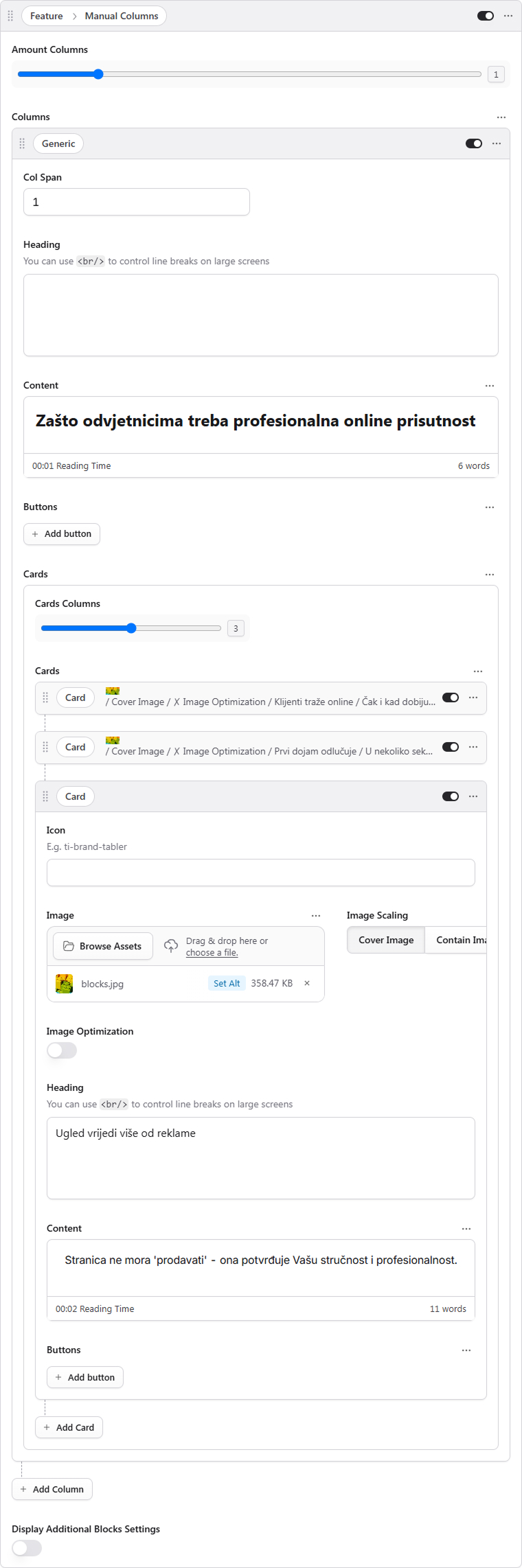
First off, you need to assess the structure of the content you want to display on the page. Most of the manipulations with the final styling can be handled at the final styling stage, but for now, it's worth creating a similar structure. For most tasks, using the Manual columns block will work just fine.
Let's try to recreate a similar block.
Add a Manual columns block and insert your text content.
Add a column with an image. In the example, we can see that the image is positioned on the background of the text content—we'll handle this manipulation later on.
Adding Semantic Classes
Understanding ID and Class in HTML
In HTML, id and class are attributes used to identify and style elements. An id is a unique identifier that should only be used once per page, making it perfect for targeting specific elements. A class, on the other hand, can be reused multiple times across different elements, which makes it ideal for applying consistent styling to groups of elements. Both attributes serve as hooks that allow you to apply CSS styles and JavaScript functionality to your HTML elements.
Working with Block Settings
We have additional parameters available in our blocks that allow you to add styles, classes, and IDs to blocks. To see these options, simply toggle on the "Display additional blocks settings" switch to view the available fields.
What Are Semantic Classes?
Semantic classes are CSS class names that describe the purpose or meaning of an element rather than its visual appearance. For example, using a class like hero-section or primary-navigation tells you what the element represents, making your code more readable and maintainable. This approach helps developers quickly understand the structure and purpose of different page elements.
All blocks come with built-in semantic classes, and you can learn more about them in the template documentation. However, for creating custom styling, it's recommended to also add your own classes to either the block or the container (the container sits inside the block) to make further styling easier.
For this particular example, let's go ahead and add the following:
ID:
heroClasses:
dark(since the text should be light-colored) andbg-image
Styles
Let’s add some styling into Globals → Theme
.bg-image{
    position: relative;

    & .manual-columns-container{
        & > div > figure.picture{
            position: absolute;
            top: 0px;
            left: 0px;
            width: 100%;
            height: 100%;
            z-index: 0;
            filter: brightness(0.2);

            & > img {
                border-radius: 0px !important;
            }
        }

        & > div:not(:has(figure.picture)){
            z-index: 1;
            text-align: center;
            padding-block: 64px;

            @media (max-width: 768px) {
                padding-block: 32px;
            }

            & > div.flex{
                max-width: 740px;
                margin-inline: auto;

                @media (max-width: 768px) {
                    max-width: 100%;
                }
            }

            & .article__buttons{
                justify-content: center;
                margin-bottom: 24px;
            }
        }
    }
}
Card Section
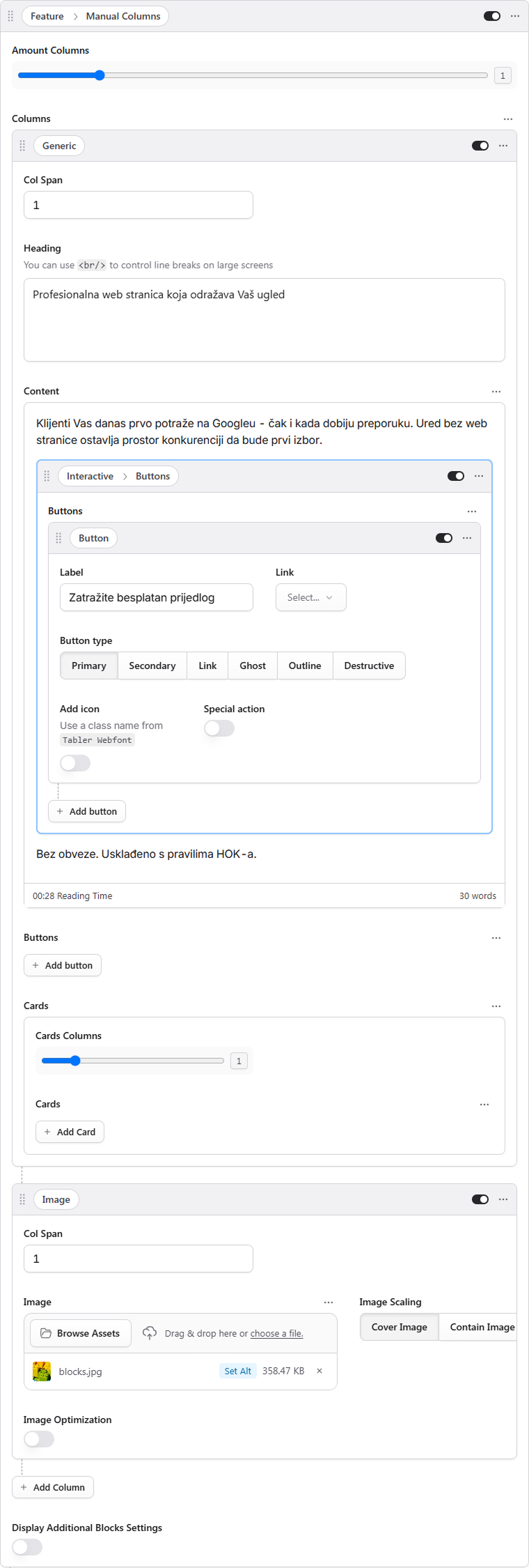
Now, this particular section can also be built out using the Manual columns block. What we'll do here is add just a single column—specifically, a generic one. This type of column gives you the flexibility to add both text content and cards.
Each individual card has the ability to contain either an icon or an image, alongside a heading and some text content.
In our current example, this block doesn't necessarily need any extra adjustments right out of the box. However, for the sake of illustration, let's add a semantic class to the block—we'll call it center-aligned-cards. Then, we can hop into the global collection and add some custom styles there to modify the maximum width of the container and throw in some basic styling for the cards themselves.
.center-aligned-cards{
    text-align: center;

    & .container{
        max-width: 900px;
    }

    & .card{
        padding-block: 48px;
    }
}
Customizing Styles for Individual Block Parts

Now, in this particular example, you'll notice that the text within our cards is aligned to the left side. To achieve this type of styling, we'll need to add a semantic class that handles this specific customization.
Here's how you can do that: in all blocks, you have the option to display the dev settings by simply turning on the corresponding switch. Once that's enabled, go ahead and add the class align-left. After that, we'll jump into globals → theme and add our custom styles there.
.align-left{
	text-align: left;
}
Custom Blocks
Now, there are times when bringing your design concept to life requires the implementation of custom blocks. Fortunately, the template comes equipped with a pretty extensive range of style settings, which means that within the page editor, you can typically just recreate the structure you're looking for and add semantic classes for any further customization—all directly within the editor.
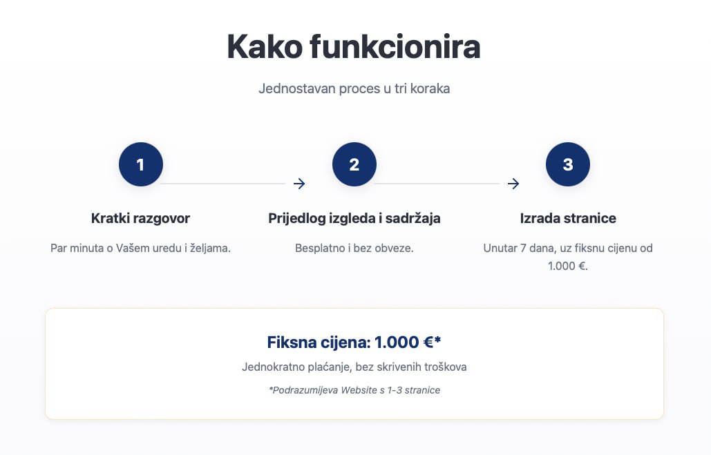
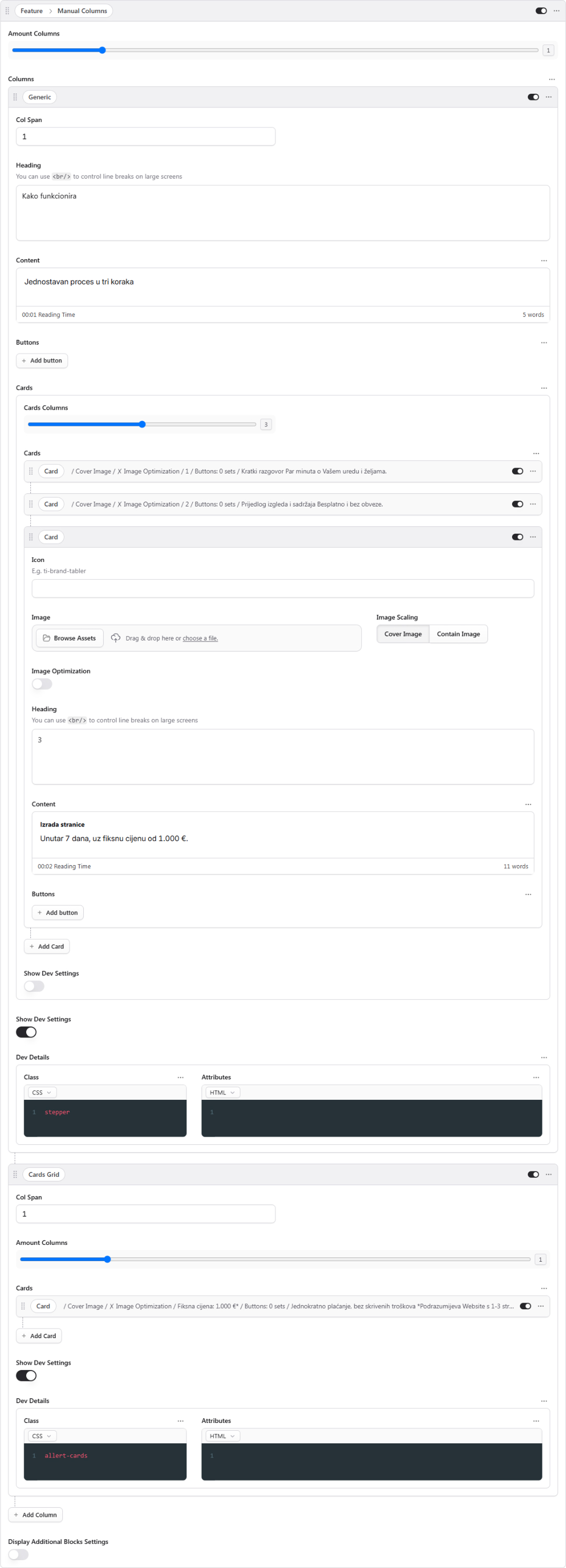
Let's look at this example: here, we've divided the Manual Columns block into two distinct parts—a generic column and grid columns. The generic column holds our text content along with some cards, and we've added the class stepper to it. Meanwhile, the grid columns section contains a single card and uses the alert-cards class to apply the styling we need.
.stepper{
    text-align: center;

    & .card{
        padding: 0px;
        background: transparent;
        border: none;
        border-radius: 0px;
        z-index: 1;
        position: relative;
        overflow: visible;

        & .card-content > h3{
            height: 48px;
            width: 48px;
            display: flex;
            justify-content: center;
            align-items: center;
            background: var(--color-primary);
            color: var(--color-background);
            margin: 0 auto;
            border-radius: 50%;
        }

        &:not(:last-child)::after{
            content: '';
            position: absolute;
            top: 24px;
            left: calc(50% + 24px);
            width: calc(100%);
            height: 1px;
            background: var(--color-primary);
        }
    }
}

.alert-cards{
    & .card{
        border-color: var(--color-primary);
        text-align: center;
    }
}